Chapter 3 Modeling with Basic Regression
Equipped with your understanding of the general modeling framework, in this chapter, we will cover basic linear regression where you will keep things simple and model the outcome variable y as a function of a single explanatory/ predictor variable x. We will use both numerical and categorical x variables. The outcome variable of interest in this chapter will be teaching evaluation scores of instructors at the University of Texas, Austin.
Explaining teaching score with age VIDEO
3.1 Plotting a “best-fitting” regression line
Previously you visualized the relationship of teaching score and “beauty score” via a scatterplot. Now let’s add the “best-fitting” regression line to provide a sense of any overall trends. Even though you know this plot suffers from overplotting, you’ll stick to the non-jitter version.
- Add a regression line without the error bars to the scatterplot.
# Load packages
library(ggplot2)
library(dplyr)
library(moderndive)
# Plot
ggplot(evals, aes(x = bty_avg, y = score)) +
  geom_point() +
  labs(x = "beauty score", y = "score") +
  geom_smooth(method = "lm", se = FALSE) +
  theme_bw()
`geom_smooth()` using formula 'y ~ x'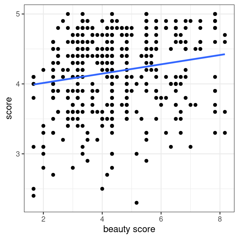
The overall trend seems to be positive! As instructors have higher “beauty” scores, so also do they tend to have higher teaching scores.
3.2 Fitting a regression with a numerical x
Let’s now explicity quantify the linear relationship between score and bty_avg using linear regression. You will do this by first “fitting” the model. Then you will get the regression table, a standard output in many statistical software packages. Finally, based on the output of get_regression_table(), which interpretation of the slope coefficient is correct?
- Fit a linear regression model between score and average beauty using the
lm()function and save this model tomodel_score_2.
# Fit model
model_score_2 <- lm(score ~ bty_avg, data = evals)
model_score_2
Call:
lm(formula = score ~ bty_avg, data = evals)

Coefficients:
(Intercept)      bty_avg
3.88034 0.06664 - Given the sparsity of the output, let’s get the regression table using the get_regression_table() wrapper function.
# Output regression table
get_regression_table(model_score_2)
# A tibble: 2 × 7
term estimate std_error statistic p_value lower_ci upper_ci
<chr> <dbl> <dbl> <dbl> <dbl> <dbl> <dbl>
1 intercept 3.88 0.076 51.0 0 3.73 4.03
2 bty_avg 0.067 0.016 4.09 0 0.035 0.099Highlight the correct answer:
For every person who has a beauty score of one, their teaching score will be 0.0670.
For every increase of one in beauty score, you should observe an associated increase of on average 0.0670 units in teaching score.
Less “beautiful” instructors tend to get higher teaching evaluation scores.
Note: As suggested by your exploratory visualization, there is a positive relationship between “beauty” and teaching score.
Predicting teaching score with age VIDEO
3.3 Making predictions using “beauty score”
Say there is an instructor at UT Austin and you know nothing about them except that their beauty score is 5. What is your prediction \(\hat{y}\)̂ of their teaching score \(y\)?
get_regression_table(model_score_2)# A tibble: 2 × 7
term estimate std_error statistic p_value lower_ci upper_ci
<chr> <dbl> <dbl> <dbl> <dbl> <dbl> <dbl>
1 intercept 3.88 0.076 51.0 0 3.73 4.03
2 bty_avg 0.067 0.016 4.09 0 0.035 0.099- Using the values of the intercept and slope from above, predict this instructor’s score.
# Use fitted intercept and slope to get a prediction
y_hat <- 3.88 + 0.067 * 5
y_hat
[1] 4.215- Say it’s revealed that the instructor’s score is 4.7. Compute the residual for this prediction, i.e., the residual \(y - \hat{y}\).
# Compute residual y - y_hat
4.7 - y_hat
[1] 0.485Was your visual guess close to the predicted teaching score of 4.215? Also, note that this prediction is off by about 0.485 units in teaching score.
3.4 Computing fitted/predicted values & residuals
Now say you want to repeat this for all 463 instructors in evals. Doing this manually as you just did would be long and tedious, so as seen in the video, let’s automate this using the get_regression_points() function.
Furthemore, let’s unpack its output.
Let’s once again get the regression table for
model_score_2.Apply
get_regression_points()from themoderndivepackage to automate making predictions and computing residuals.
# Fit regression model
model_score_2 <- lm(score ~ bty_avg, data = evals)
# Get regression table
get_regression_table(model_score_2)
# A tibble: 2 × 7
term estimate std_error statistic p_value lower_ci upper_ci
<chr> <dbl> <dbl> <dbl> <dbl> <dbl> <dbl>
1 intercept 3.88 0.076 51.0 0 3.73 4.03
2 bty_avg 0.067 0.016 4.09 0 0.035 0.099# Get all fitted/predicted values and residuals
get_regression_points(model_score_2)# A tibble: 463 × 5
ID score bty_avg score_hat residual
<int> <dbl> <dbl> <dbl> <dbl>
1 1 4.7 5 4.21 0.486
2 2 4.1 5 4.21 -0.114
3 3 3.9 5 4.21 -0.314
4 4 4.8 5 4.21 0.586
5 5 4.6 3 4.08 0.52
6 6 4.3 3 4.08 0.22
7 7 2.8 3 4.08 -1.28
8 8 4.1 3.33 4.10 -0.002
9 9 3.4 3.33 4.10 -0.702
10 10 4.5 3.17 4.09 0.409
# … with 453 more rowsLet’s unpack the contents of the
score_hatcolumn. First, run the code that fits the model and outputs the regression table.Add a new column
score_hat_2which replicates howscore_hatis computed using the table’s values.
# Get all fitted/predicted values and residuals
get_regression_points(model_score_2) %>%
mutate(score_hat_2 = 3.88 + 0.067 * bty_avg)# A tibble: 463 × 6
ID score bty_avg score_hat residual score_hat_2
<int> <dbl> <dbl> <dbl> <dbl> <dbl>
1 1 4.7 5 4.21 0.486 4.22
2 2 4.1 5 4.21 -0.114 4.22
3 3 3.9 5 4.21 -0.314 4.22
4 4 4.8 5 4.21 0.586 4.22
5 5 4.6 3 4.08 0.52 4.08
6 6 4.3 3 4.08 0.22 4.08
7 7 2.8 3 4.08 -1.28 4.08
8 8 4.1 3.33 4.10 -0.002 4.10
9 9 3.4 3.33 4.10 -0.702 4.10
10 10 4.5 3.17 4.09 0.409 4.09
# … with 453 more rowsNow let’s unpack the contents of the
residualcolumn. First, run the code that fits the model and outputs the regression table.Add a new column
residual_2which replicates howresidualis computed using the table’s values.
# Get regression table
get_regression_table(model_score_2)
# A tibble: 2 × 7
term estimate std_error statistic p_value lower_ci upper_ci
<chr> <dbl> <dbl> <dbl> <dbl> <dbl> <dbl>
1 intercept 3.88 0.076 51.0 0 3.73 4.03
2 bty_avg 0.067 0.016 4.09 0 0.035 0.099# Get all fitted/predicted values and residuals
get_regression_points(model_score_2) %>%
mutate(residual_2 = score - score_hat)# A tibble: 463 × 6
ID score bty_avg score_hat residual residual_2
<int> <dbl> <dbl> <dbl> <dbl> <dbl>
1 1 4.7 5 4.21 0.486 0.486
2 2 4.1 5 4.21 -0.114 -0.114
3 3 3.9 5 4.21 -0.314 -0.314
4 4 4.8 5 4.21 0.586 0.586
5 5 4.6 3 4.08 0.52 0.520
6 6 4.3 3 4.08 0.22 0.220
7 7 2.8 3 4.08 -1.28 -1.28
8 8 4.1 3.33 4.10 -0.002 -0.00200
9 9 3.4 3.33 4.10 -0.702 -0.702
10 10 4.5 3.17 4.09 0.409 0.409
# … with 453 more rowsYou’ll see later that the residuals can provide useful information about the quality of your regression models. Stay tuned!
Explaining teaching score with gender VIDEO
3.5 EDA of relationship of score and rank
Let’s perform an EDA of the relationship between an instructor’s score and their rank in the evals dataset. You’ll both visualize this relationship and compute summary statistics for each level of rank: teaching, tenure track, and tenured.
- Write the code to create a boxplot of the relationship between teaching
scoreandrank.
ggplot(data = evals, aes(x = rank, y = score)) +
  geom_boxplot() +
  labs(x = "rank", y = "score") +
  theme_bw()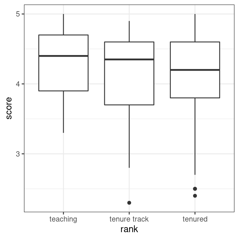
For each unique value in
rank:Count the number of observations in each group
Find the mean and standard deviation of score
evals %>%
  group_by(rank) %>%
  summarize(xbar = mean(score), SD = sd(score), n = n())
# A tibble: 3 × 4
rank xbar SD n
<fct> <dbl> <dbl> <int>
1 teaching 4.28 0.498 102
2 tenure track 4.15 0.561 108
3 tenured 4.14 0.550 253The boxplot and summary statistics suggest that teaching get the highest scores while tenured professors get the lowest. However, there is clearly variation around the respective means.
3.6 Fitting a regression with a categorical x
You’ll now fit a regression model with the categorical variable rank as the explanatory variable and interpret the values in the resulting regression table. Note here the rank “teaching” is treated as the baseline for comparison group for the “tenure track” and “tenured” groups.
- Fit a linear regression model between
scoreandrank, and then apply the wrapper function tomodel_score_4that returns the regression table.
model_score_4 <- lm(score ~ rank, data = evals)
get_regression_table(model_score_4)
# A tibble: 3 × 7
term estimate std_error statistic p_value lower_ci upper_ci
<chr> <dbl> <dbl> <dbl> <dbl> <dbl> <dbl>
1 intercept 4.28 0.054 79.9 0 4.18 4.39
2 rank: tenure track -0.13 0.075 -1.73 0.084 -0.277 0.017
3 rank: tenured -0.145 0.064 -2.28 0.023 -0.27 -0.02 - Based on the regression table, compute the 3 possible fitted values \(\hat{y}\)̂ , which are the group means. Since “teaching” is the baseline for comparison group, the
interceptis the mean score for the “teaching” group andranktenuretrack/ranktenuredare relative offsets to this baseline for the “tenure track”/“tenured” groups.
# teaching mean
(teaching_mean <- 4.28)
[1] 4.28# tenure track mean
(tenure_track_mean <- 4.28 - 0.13)[1] 4.15# tenured mean
(tenured_mean <- 4.28 - 0.145)[1] 4.135Remember that regressions with a categorical variable return group means expressed relative to a baseline for comparison!
Predicting teaching score with gender VIDEO
3.7 Making predictions using rank
Run get_regression_table(model_score_4) in the console to regenerate the regression table where you modeled score as a function of rank. Now say using this table you want to predict the teaching score of an instructor about whom you know nothing except that they are a tenured professor. Which of these statements is true?
A good prediction of their score would be \(4.28 - 0.145 = 4.135\).
A good prediction of their score would be \(-0.145\).
There is no information in the table that can aid your prediction.
Note: Regression tables for categorical explanatory variables show differences in means relative to a baseline.
3.8 Visualizing the distribution of residuals
Let’s now compute both the predicted score\(\hat{y}\)̂ and the residual \(y - \hat{y}\) for all \(n = 463\) instructors in the evals dataset. Furthermore, you’ll plot a histogram of the residuals and see if there are any patterns to the residuals, i.e. your predictive errors.
model_score_4 from the previous exercise is available in your workspace.
- Apply the function that automates making predictions and computing residuals, and save these values to the dataframe
model_score_4_points.
model_score_4_points <- get_regression_points(model_score_4)
model_score_4_points
# A tibble: 463 × 5
ID score rank score_hat residual
<int> <dbl> <fct> <dbl> <dbl>
1 1 4.7 tenure track 4.16 0.545
2 2 4.1 tenure track 4.16 -0.055
3 3 3.9 tenure track 4.16 -0.255
4 4 4.8 tenure track 4.16 0.645
5 5 4.6 tenured 4.14 0.461
6 6 4.3 tenured 4.14 0.161
7 7 2.8 tenured 4.14 -1.34
8 8 4.1 tenured 4.14 -0.039
9 9 3.4 tenured 4.14 -0.739
10 10 4.5 tenured 4.14 0.361
# … with 453 more rows- Now take the
model_score_4_pointsdataframe to plot a histogram of theresidualcolumn so you can see the distribution of the residuals, i.e., the prediction errors.
# Plot residuals
ggplot(model_score_4_points, aes(x = residual)) +
  geom_histogram() +
  labs(x = "residuals", title = "Residuals from score ~ rank model") +
  theme_bw()
`stat_bin()` using `bins = 30`. Pick better value with `binwidth`.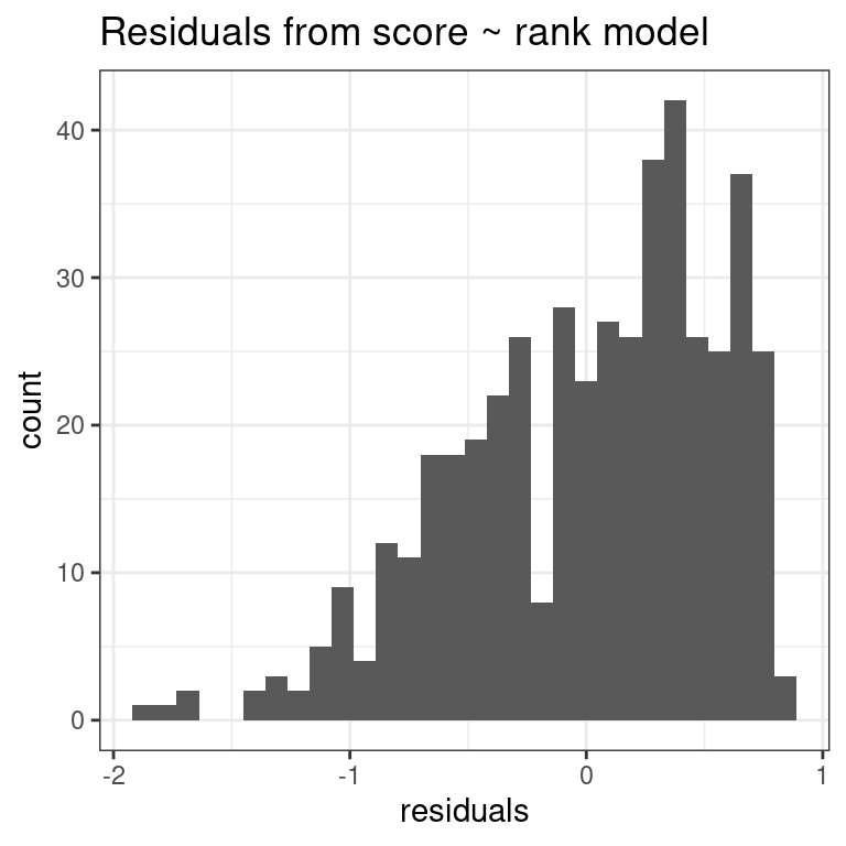
Look at the distribution of the residuals. While it seems there are fewer negative residuals corresponding to overpredictions of score, the magnitude of the error seems to be larger (ranging all the way to -2).